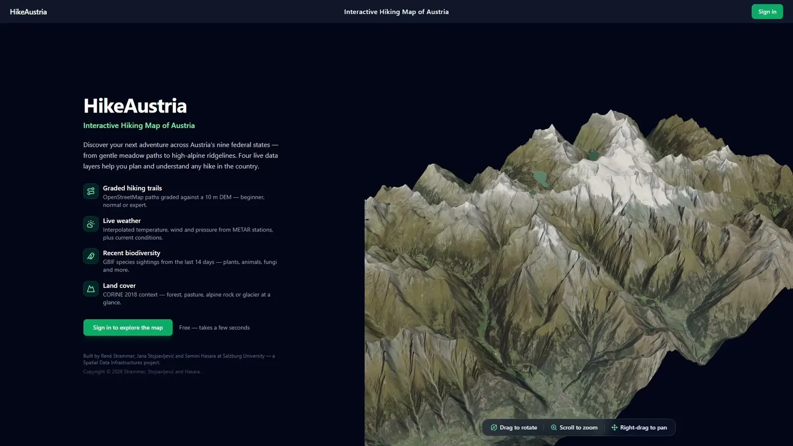
HikeAustria started as a simple university project focusing on creating a hiking map for Austria that also offers live weather data to users. The application also had to grade and show the hiking trails, colour them by difficulty and let people find a route that fits their level and the weather. The interesting part of that project was never the map itself. It was everything behind it, i.e. turning four different data sources into a coherent, standards-based spatial data infrastructure (SDI) that a browser could actually talk to. You can see the final state of the project in the video above.
In this project I worked together with two of my colleagues for a university class. My work focused on the code while my colleagues focused on project management. I built the data processing pipelines and the SDI implementation from raw data ingestion all the way to the running app. This post is the story of that pipeline, and of the constraints that quietly decided most of its shape and taught me a lot about geospatial software projects.
Table of contents
Open Table of contents
Four data pillars, one map
The map rests on four datasets, each with its own quirks:
- Hiking trails from OpenStreetMap (OSM) (every
waytagged withsac_scale), graded by difficulty. For a commercial product, you would use a dataset by a local alpine club, but none of us was a member of such a club at that time and we also did not want to buy such a dataset, so we used the less accurate but still decent OSM data. The trails have been graded against a DEM once manually. - Weather from FAA METAR reports at 17 airports across Austria and its neighbouring countries, taking temperature, wind, pressure and current conditions from their API.
- Land cover from Copernicus CORINE (CLC2018), 44 classes clipped to Austria. This was done once manually.
- Biodiversity from GBIF. Also clipped to Austria and pulled automatically from their API at midnight for the last 2 weeks.
Four data sources, three CRS, two update rhythms, and the task of making them queryable through the same web map.
The shape of an SDI
An SDI is not just a database with a map on top. Instead data is stored once, served through open standards, described with metadata, and therefore discoverable and reusable by anything that speaks those standards. In general the SDI offers services that can be connected to from any device that also understands those services (i.e., interoperability) but if the data is classified or proprietary, it is also possible to lock down the access to the services by using Credential Managers or locking down GeoServer and the database (RLS with Credential Manager authentication). Our processing chain looked like this:
raw sources → ETL Pipeline → PostgreSQL/PostGIS → GeoServer (WMS/WFS) → React map in the browser
                                    ↑                     ↑
                              ISO 19115/19139        SLD styles +
                              metadata & catalogue   render-time interpolation
PostGIS is the central source of truth. GeoServer publishes each layer as WMS (rendered with legends and feature info) and WFS (i.e. raw vectors). Metadata is authored as ISO 19115, exported to ISO 19139 XML, and pushed to a catalogue so the layers are findable. The metadata part is one that people often forget but it is a necessary part of every SDI (even if it is boring). You can see the full architecture in the following diagram.

One database, four different ways in
The four data pillars don’t arrive the same way, so they don’t get ingested the same way.
The bulk, slow-moving layers (trails, land cover) come in through Python ETL
scripts using GeoPandas to read the GeoPackages, psycopg2 to batch-insert the data with
execute_values and spatial indexes:
CREATE INDEX ON hiking_trails USING gist (geom);The trails and land cover had a lot of entries but since they are vector data, they were relatively small and easy to push into the database.
The live layers (weather every 5 minutes, biodiversity at midnight) run in
Node-RED instead with the following processing chain trigger → http request → pull → transform → SQL → Postgres. Node-RED is a useful tool that I was introduced to in the course and you can think of it like a visual chain builder where you connect boxes with different functionalities that model your processing chain. Then you just enter your parameters into these boxes (like website links and database connection parameters) and it runs like a cronjob in the background.
The weather flow polls the METAR API and upserts (= inserts and updates) 17 stations into the database. The biodiversity flow
truncates and rebuilds its table each night, which makes it self-healing. That means that
if a run fails, the next one simply rebuilds from scratch. GBIF’s API caps
pagination at 100,000 records, so the flow walks pages up to a hard offset and a
rolling 14-day window instead of crashing when sightings pile up in summer. The 14-day window is not a hard rule. I just played around a lot with the GBIF API and found that I will most likely not hit 100,000 records if I don’t go beyond 2 weeks of data.
Whatever the path, every layer follows the same house rules: keep it in its
native CRS and reproject with ST_Transform at query time, index the
geometry with GIST, and keep the untouched source payload in a jsonb column.
That consistency is what later makes cross-pillar joins trivial.
The constraint that shaped everything
Here is the decision that rippled through the whole design. The shared course database had the PostGIS raster extension switched off, which is actually a very smart step that our professor took. Storing rasters in a database is not a good idea in most cases since database engines store raster objects as binary large objects (blobs) and cannot query them efficiently.
This “limitation” forced me to find better solutions, since raster data was needed to grade the hiking trails against a relatively accurate real world elevation model. The idea was to grade hiking trails on a very steep terrain as more challenging than trails on a very flat one.
So, the 10 m digital elevation model couldn’t live in the database. Therefore, it stayed as a local file and was only ever used to derive trail metrics. The heavy raster data stays at the source and only the slim, derived hiking trail vector data flows downstream into the database. I built a simple grading script in Python for the hiking trails and the raster data so that I could enrich the hiking trails with my own grades and push the graded trails afterwards into the database.
Next, the weather API only offered point data observations (the weather station point data) but I wanted to bring raster surfaces of temperature and wind into the web map because I thought that that was an important feature for our user group. Adhering to the raster file “limitations” of the database, I did not compute them locally and store them in the database, but instead decided to interpolate them at render time inside GeoServer, using a Barnes surface built from the 17 live stations on every request. For this specific use case this is a fitting solution, even though I would not use Barnes surface interpolation again but instead inverse distance weighting (IDW) interpolation. The temperature map is always current and reflects the latest weather observations, straight from the live table, with no cron job baking tiles that go stale a couple of minutes later.
There is still a lot that I could have made better in this ingestion methodology but overall I am pretty proud of this so far.
Grading a trail is easy — until you look at the data
I have to mention that grading the trail difficulty model was the most fun to build and also the most humbling. The rough processing chain has been described above but I want to dive deeper into the grading process again, because it shows how complex something like “grading a hiking trail against a DEM” can become. So stick with me here, as you can probably also learn something valuable. The algorithm is straightforward in theory:
- Reproject each trail to the DEM’s CRS.
- Densify it so there’s a vertex at least every 20 m.
- Sample the elevation at each vertex straight from the DEM array.
- Compute length, ascent, and the maximum and mean gradient.
- Fold those into one normalised score like this:
score = (
    0.55 * (max_grade_pct / 35)
    + 0.30 * (ascent_m / 1200)
    + 0.15 * (length_km / 12)
)- Grade the score into the official SAC hiking scale with levels ranging from T1 (beginner) to T6 (challenging mountain hiking).
From that single calculated score I derive three grades by scaling the bin thresholds to reflect a cautious grade for beginners, a realistic one, and an optimistic one for experts. It is the same trail but with three honest answers depending on who’s asking. In the app it’s just a style switch.
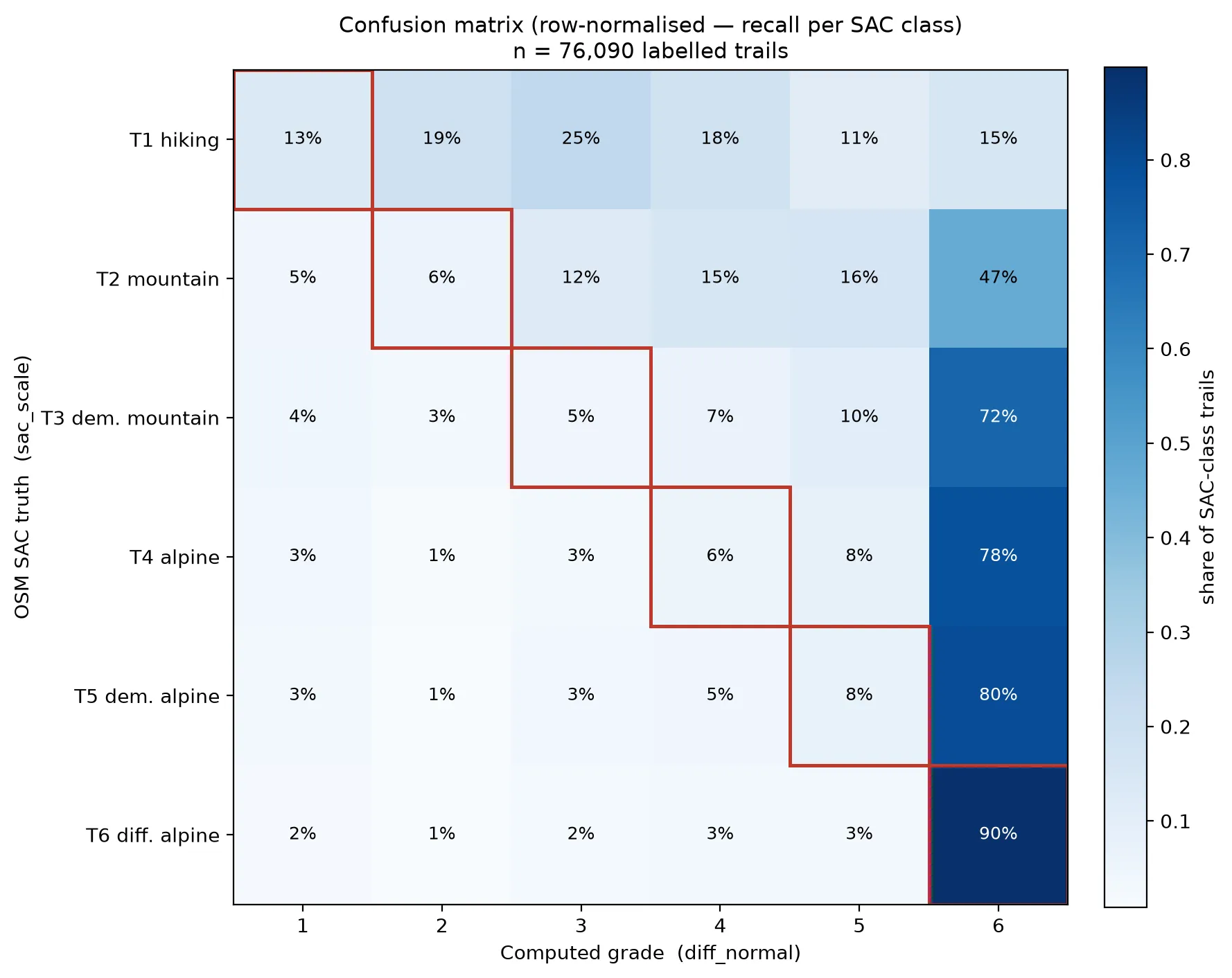
Then I plotted the results against OpenStreetMap’s own sac_scale tags in a confusion matrix, and the model’s weakness was immediately visible, as it systematically over-grades. It pushes almost everything towards the SAC grade T6 (the most challenging grade) and makes trails look far more difficult than they are, so a real-world T2 or T3 often ends up labelled as a demanding T6.
The main culprit is the data. The 10 m DEM sometimes produces extremely steep gradients depending on how the raster cells happen to fall, and since max_grade_pct carries the heaviest weight in my scoring model, those spikes get amplified even further. A gentle valley path tagged T2, for example, was predicted as a T6.
This also creates the illusion of accuracy for T6 gradings: since the model labels almost everything as T6, it also “nails” genuine alpine routes (real T6) almost by accident. A real T6 comes out as a T6 simply because nearly everything does, so that high T6 score is misleading rather than impressive.
All of this shows up clearly in the row-normalised confusion matrix below. Each row is a true OSM grade and shows how my model classified those trails, so the diagonal is where we agree. The heavy skew to the right of the diagonal is exactly the over-grading, and the diagonal itself exposes the imbalance. My grades match OSM for only 13 % of T1, 6 % of T2, 5 % of T3, 6 % of T4, 8 % of T5 trails, but 90 % of T6.
Multiple fixes can be used to mitigate this:
- use a 90th-percentile gradient instead of the max
- cap the gradient near 80 %
- smooth the elevation profile
- calibrate the weights against the ground truth
- use a higher resolution DEM
But the real insight that I gained from this process was that a model is only as trustworthy as the evaluation you’re willing to run against it. Building the confusion matrix was worth more than tuning any weight because it actively showed me the quality of my model.
Serving it: one layer, many styles
On the GeoServer side, the guiding rule was to publish the layers and implement fitting
styles. Trails are one layer with three SLD styles (the three difficulty
grades), weather is one layer with several styles (a temperature surface, wind,
pressure, and a categorical “what’s happening right now” symbol style). The map
swaps them with a single WMS styles= parameter instead of juggling duplicate
layers.
The weather styling also had its problems because I just used 17 weather stations for the entirety of Austria (and surroundings), which is not nearly enough for a real implementation but fine for a university class project. Moreover, the Barnes surface interpolation answers roughly how warm it is across Austria but in hindsight I think that IDW would have generated even better results (with also more weather station data). So as a learning, I would combine FAA METAR data with the Austrian GeoSphere data to get more weather stations and interpolate using IDW. The symbol style answers what is actually happening at the location of the weather station, e.g. a thunderbolt symbol when a storm is registered there. I did not interpolate a binary “is it raining” flag from 17 points, because that would invent rain between stations.
I also got introduced to some GeoServer quirks as SLD 1.0 and 1.1 disagree
on an attribute name for text matching. The inline-SVG icons via a data: URI
aren’t supported, so weather glyphs became TrueType-font characters and one
memorable afternoon went to a StyleNotDefined error caused purely by renaming a
style without re-pointing the layer. None of it is really technically challenging but it can cost you a day or two to figure the actual problem out. All of this is also part of the job.
The last mile: a frontend and a firewall
This part was also one of the most relaxing ones for me as I was able to heavily use AI for this, since I knew exactly where I shared my data with the GeoServer and what I wanted to build, i.e. I got the architecture down and just had to implement something simple with AI. The frontend is a static React app with Leaflet for the map and a small three.js scene that renders a real Großglockner heightmap as the intro. The three.js scene was done for fun and because I wanted to see how I can use three.js (but it is actually quite engaging so maybe it was a smart UX decision). Crucially, the frontend has no backend of its own. The browser talks straight to GeoServer over WMS, asks for legends and feature info directly, and pulls base maps from public tile providers. The frontend is secured by Clerk (that’s an authentication provider) and the app could theoretically be commercialized (also via Clerk), but this is not really something I will pursue with this project.
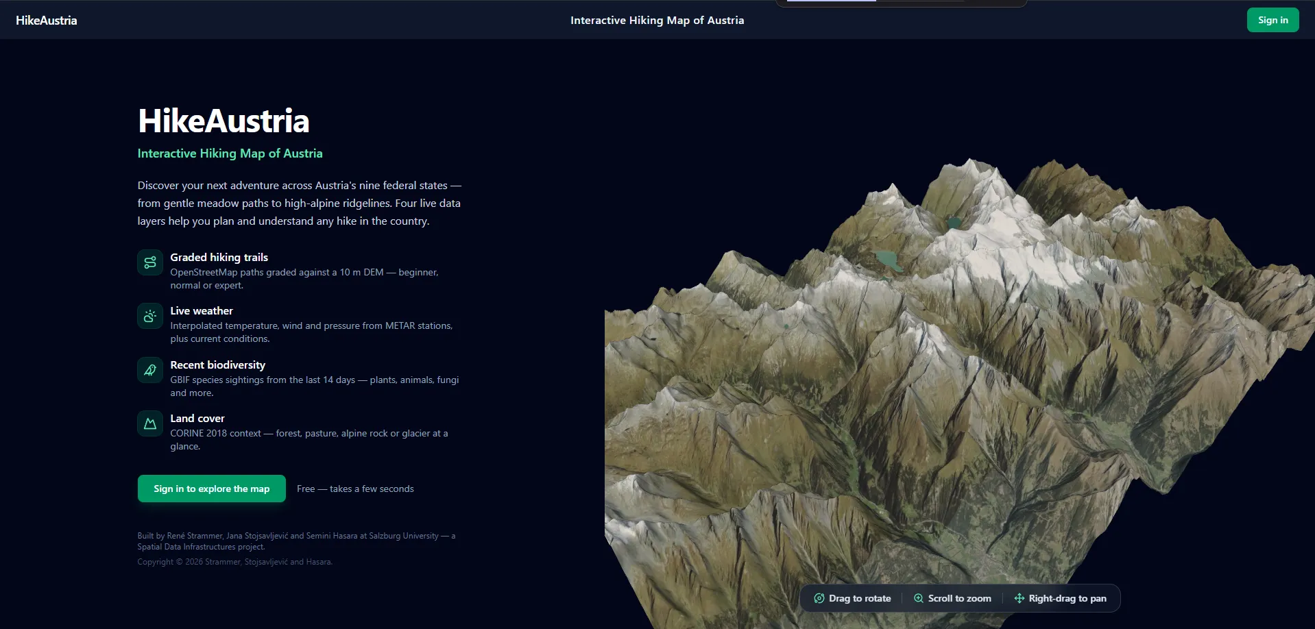
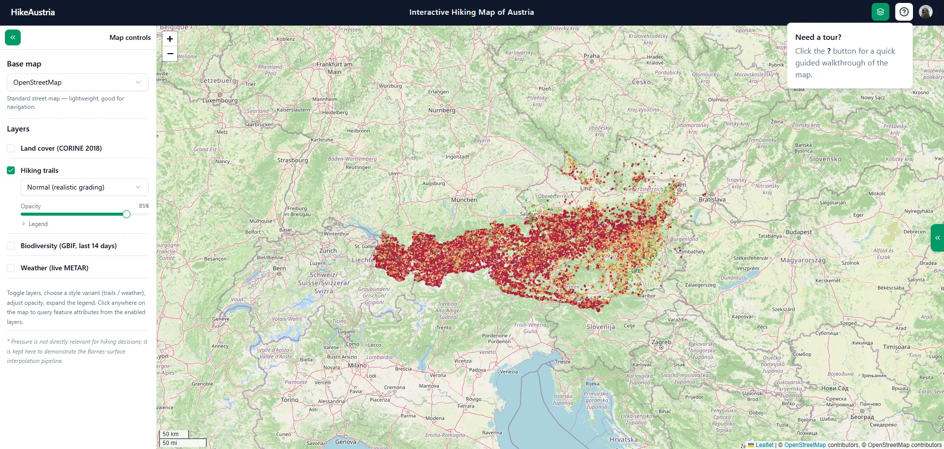
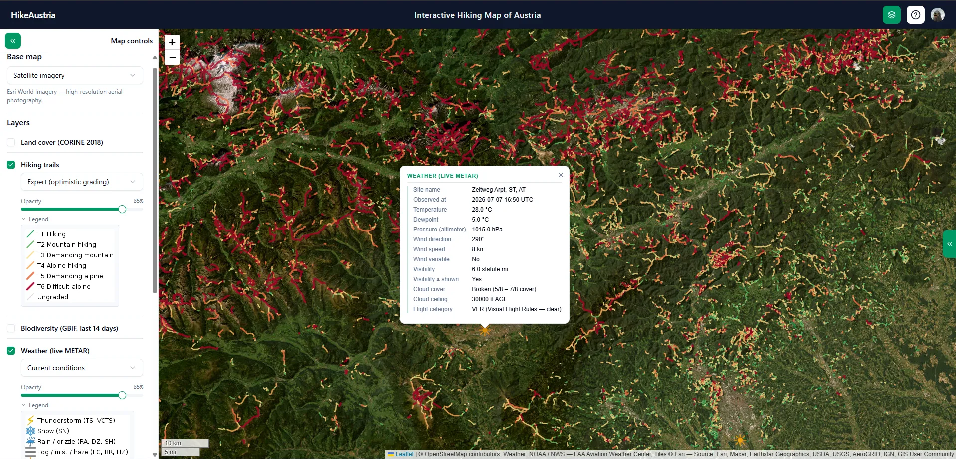
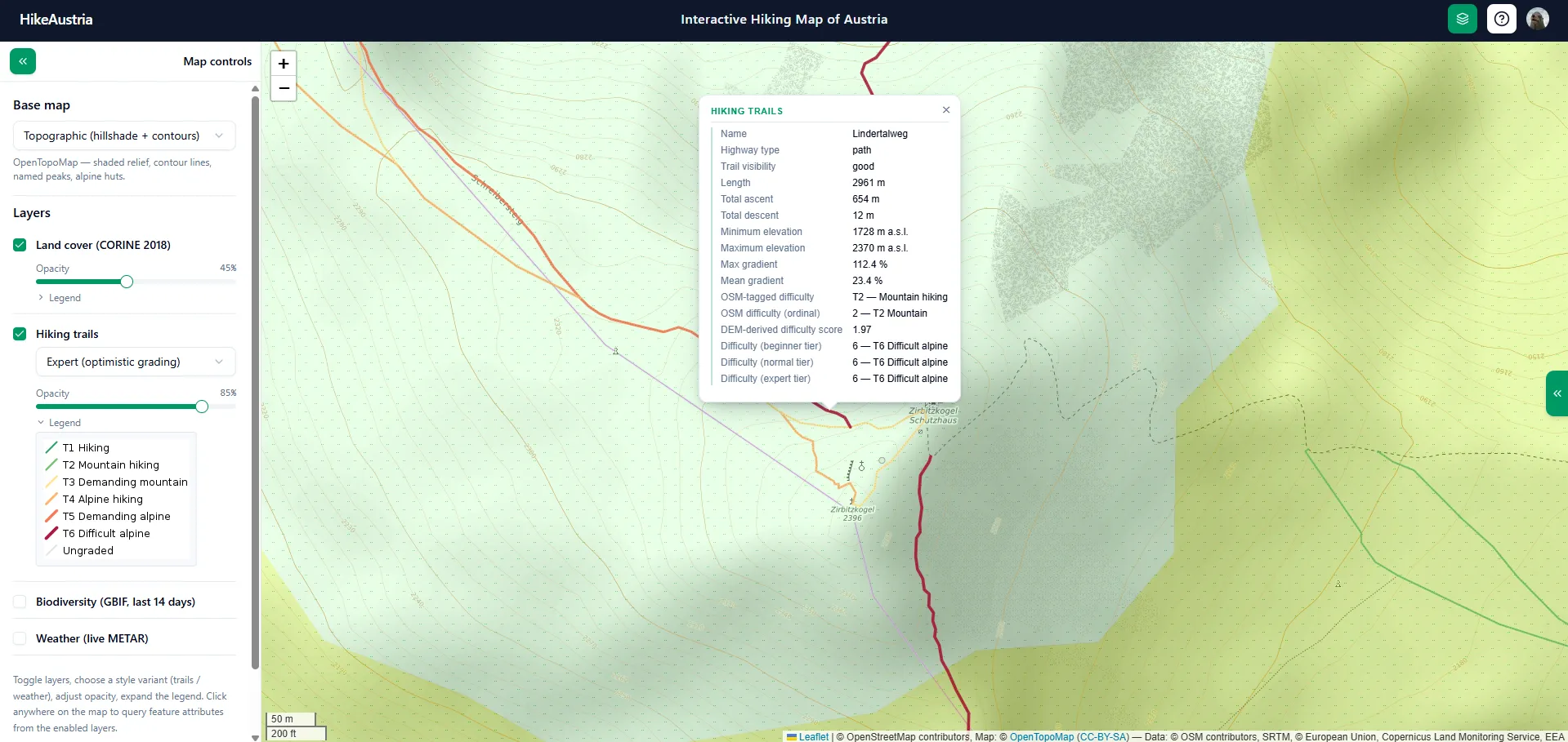
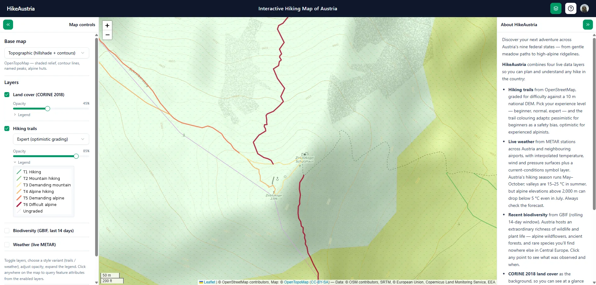
Deployment was the last plot twist. The obvious tunnelling options were blocked by the university firewall, one at the network level and one at its auth step. The only thing that worked was an outbound-only tunnel from a small VPS. I used a Cloudflare tunnel to ship the app to the world, but since the VPS was hosted by the university, they have probably already shut it down by the time you read this, so you will not be able to interact with the site anymore. I still have all of the code but I do not want to host a GeoServer and frontend for this project. Anyway, I recorded a video that you can see at the top of this post and I also made some detailed screenshots that you can see right below this text.
What I took away
By the end, HikeAustria wasn’t really about hiking. It was about whether four unrelated datasets could be pulled into one consistent, standards-based system and served through a single map. It was about how much of the design was dictated not by grand architecture but by concrete constraints, like a disabled extension, an API’s pagination limit, or a firewall’s rules. These technical details really taught me a lot. In terms of entrepreneurial activity I would have loved to focus much more on our ideal customer profile and to work with students and other people fitting our ICP to build a product they love. Well, a university course definitely gives you a lot but it cannot give you everything and I will work on this in my future projects.
Let’s get back one last time to what really stuck with me. An SDI is less about any single tool and more about how they all fit together. The combination is more valuable than just the sum of its parts. It’s the schema discipline, the technical implementation, the open OGC services, the ISO metadata, and a good portion of honesty to label what’s interpolated and what’s measured. Design and build a proper architecture and you will be able to get to a web map without much pain.
In the future I hope to find many more interesting datasets and even better ways to combine them so that I can build products for people who love to use them!
Thanks for reading!